AD® Marker
The problem:
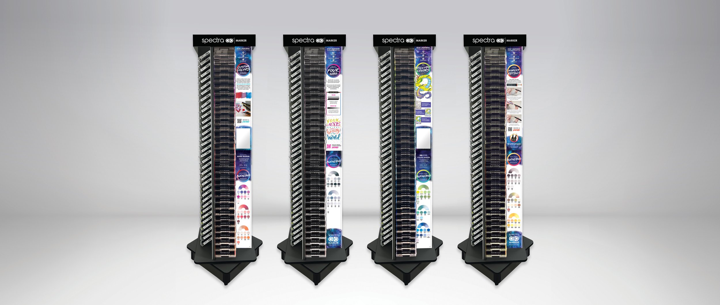
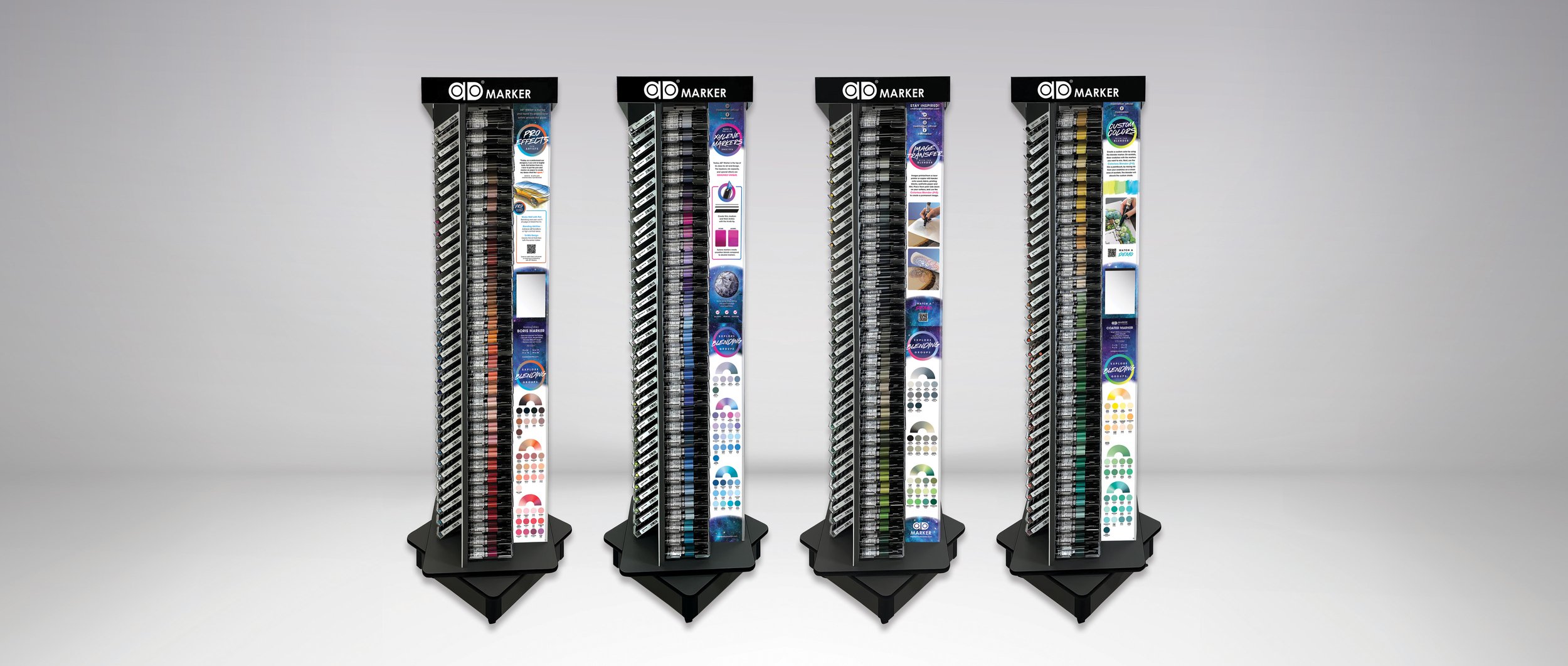
Two legacy marker brands needed to stand out in a crowded art aisle. Shoppers were gravitating to the same popular colors, and the rest of the range sat on the shelf. The challenge was to get people to explore more of the line, in a limited in-store footprint.
The solution:
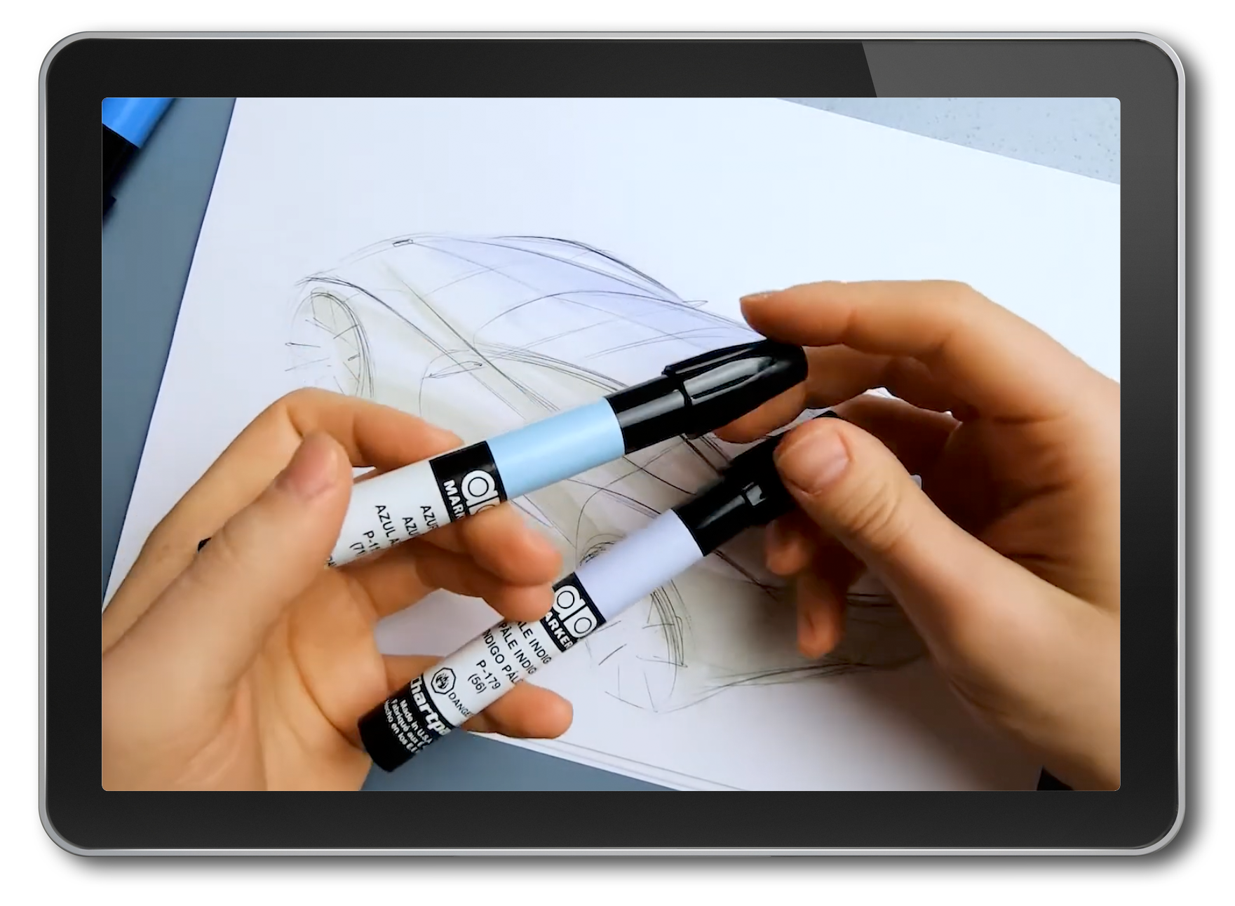
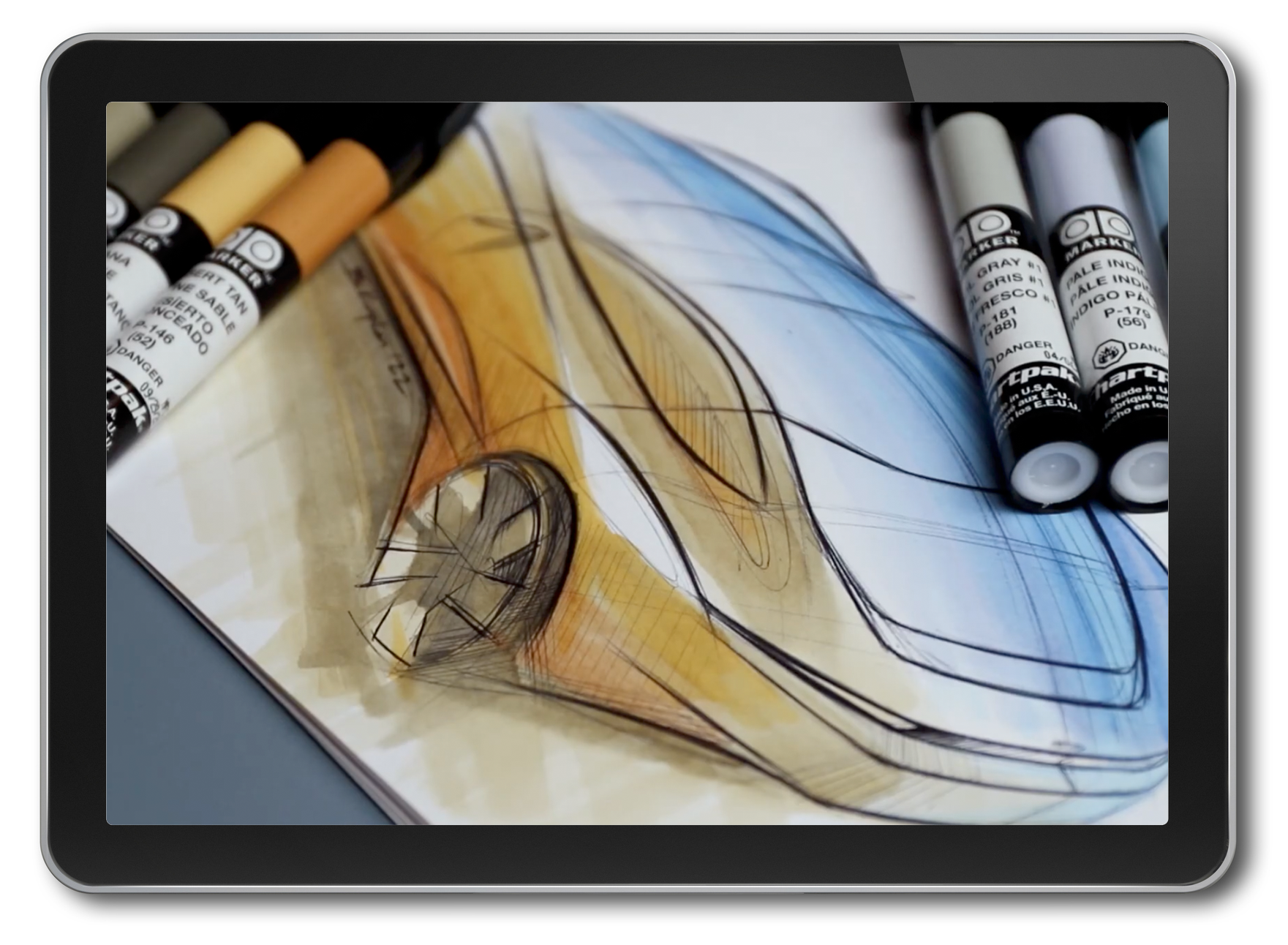
I designed the compact vertical-panel display that both informs and inspires. Working with real artists and end users, we spotlighted the markers' lesser-known features and grouped colors into blending sets that show how beautifully they work together. Shoppers who came for one color could see why they'd want more, which encouraged them to buy individual markers beyond the bestsellers and explore the full spectrum of ink. Artist videos and product demos, linked from the display, showed the blends in action.
My role:
Brand development, merchandising design, video art direction, photo direction and styling, and illustration.

videography: Berk Kaplan