
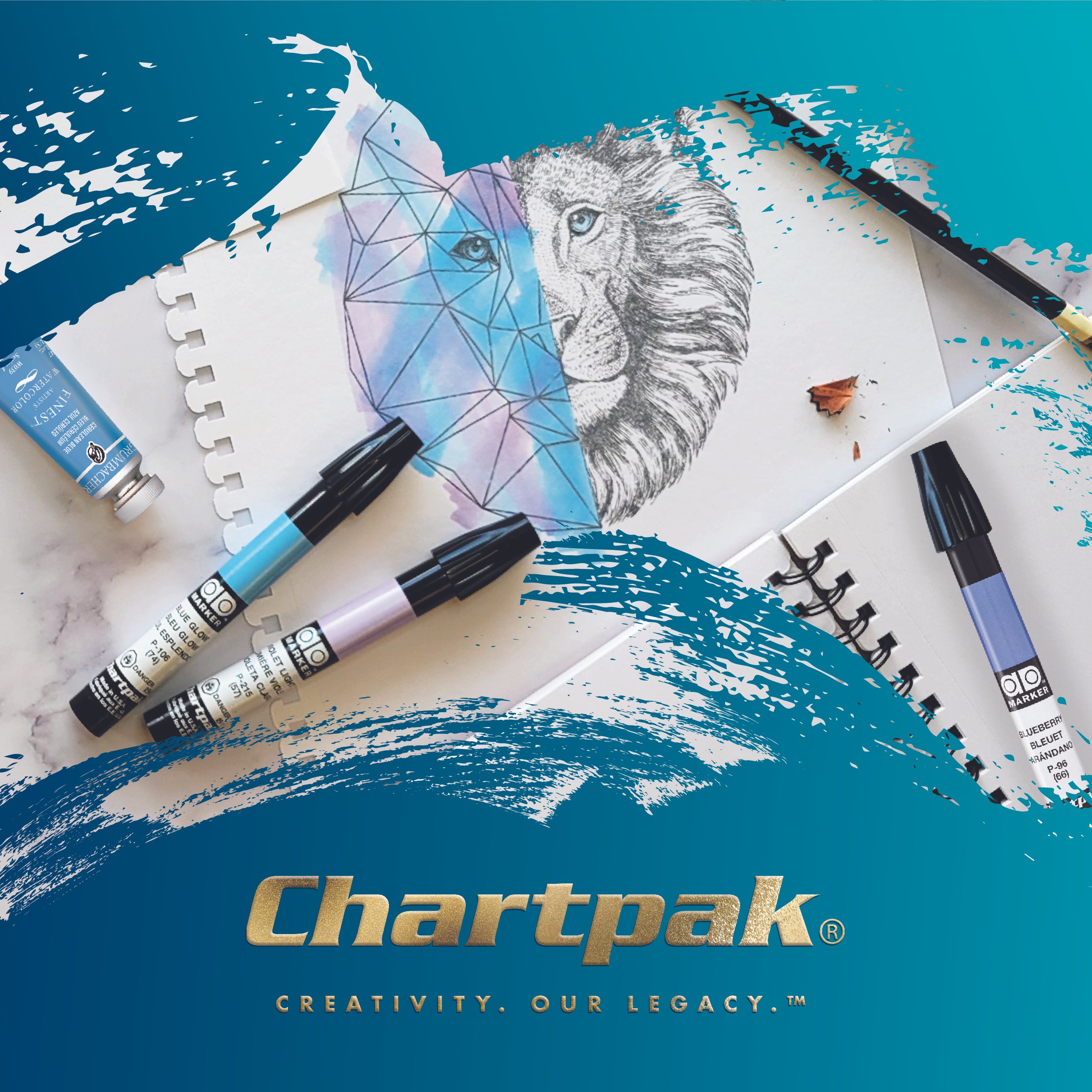
Chartpak
The problem:
Chartpak had built a reputation for making reliable tools for artists and designers, but needed branding that stood out among its portfolio of brands. The challenge was to create a visual identity that had corporate polish plus creative spirit.
The solution:
A blend of clean typography, bold colors, and a modular grid brought the vision to life. The logo grid became a graphic element in its own right, flexing to fit everything from packaging and print to digital spaces. By giving a diverse portfolio of brands a consistent framework, the system created order and cohesion while allowing each brand’s distinct personality to come through.
My role:
Brand strategy, art direction, interior graphics and web design.


