

Higgins Ink

The problem:
After 140+ years and multiple changes in ownership, the Higgins brand had become visually fragmented. The existing screen-printed bottles were inconsistent and difficult to produce, while the brand needed to connect with a contemporary audience of artists.
The solution:
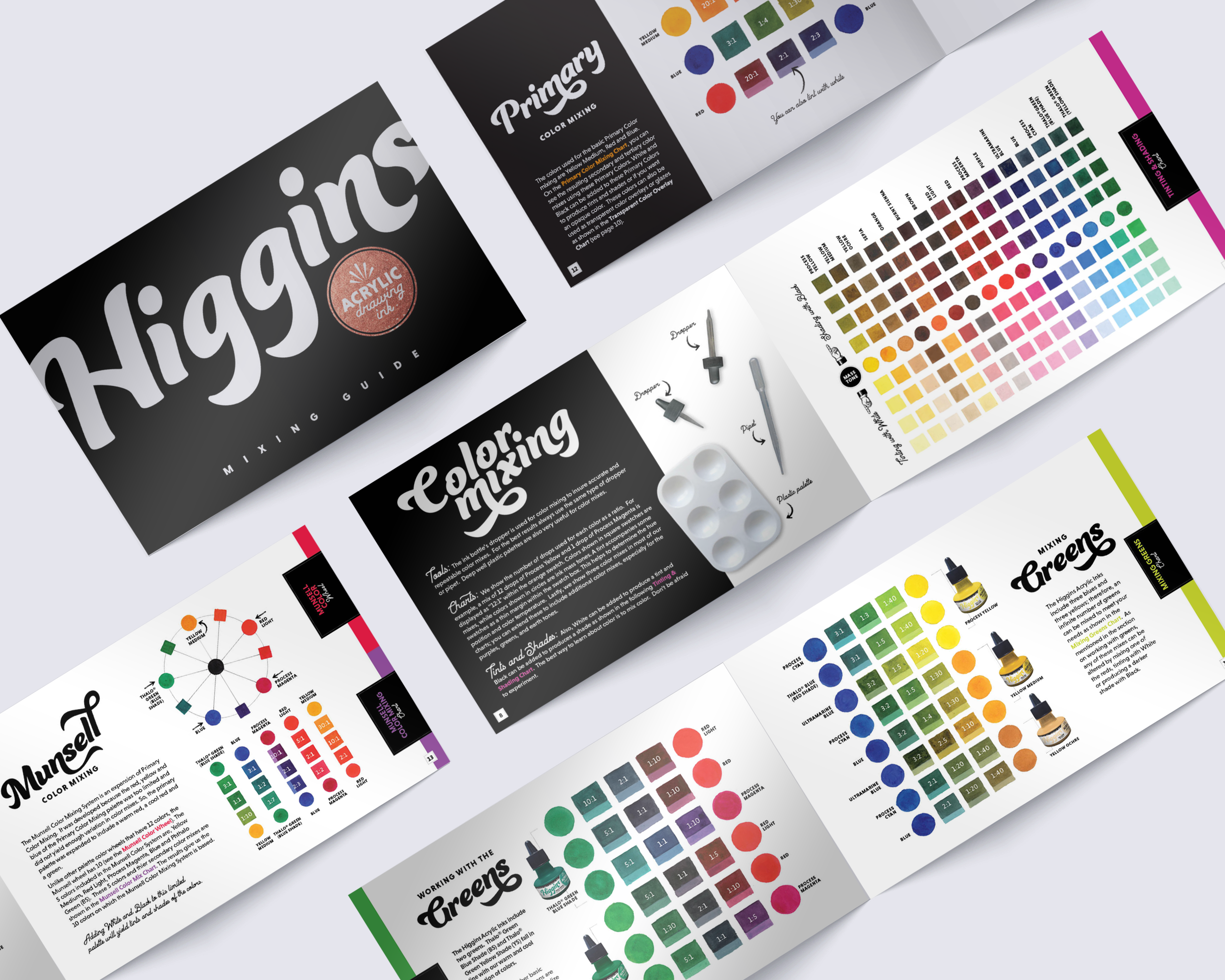
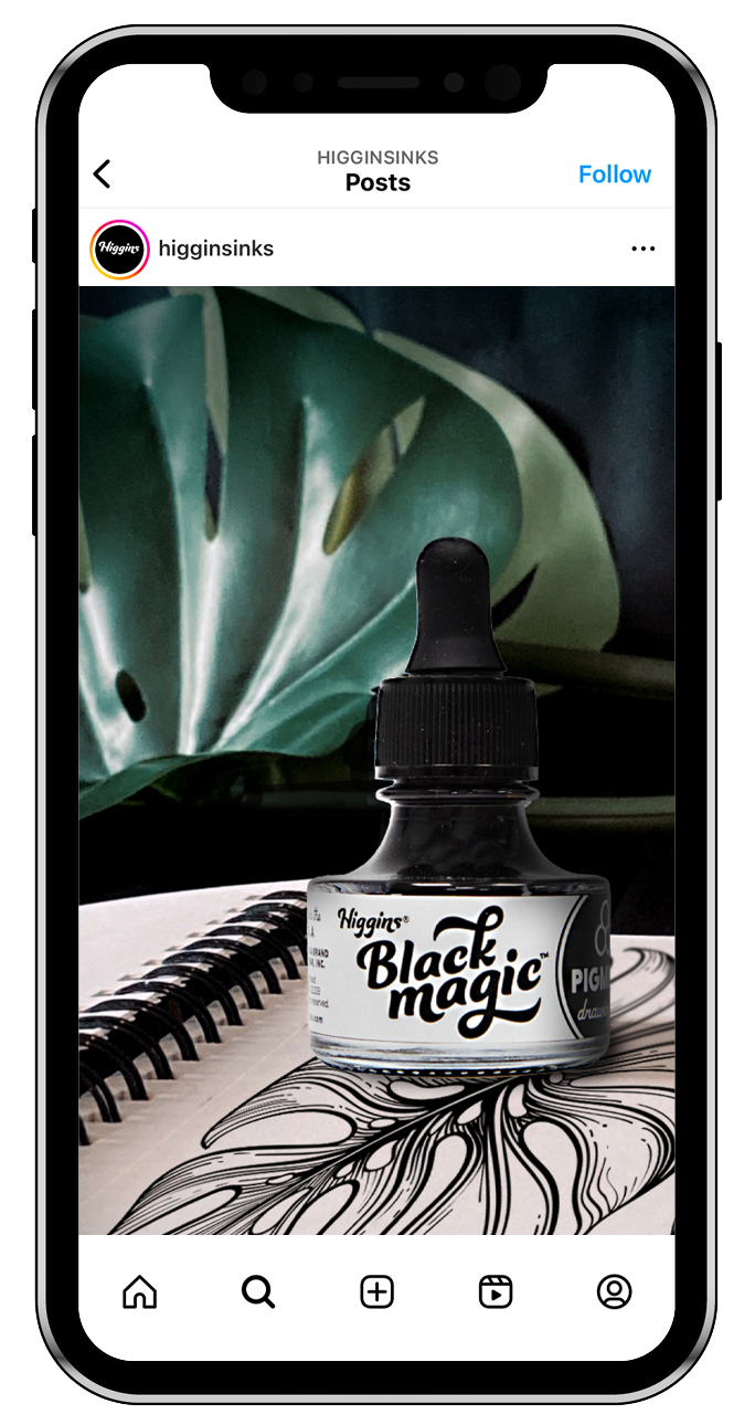
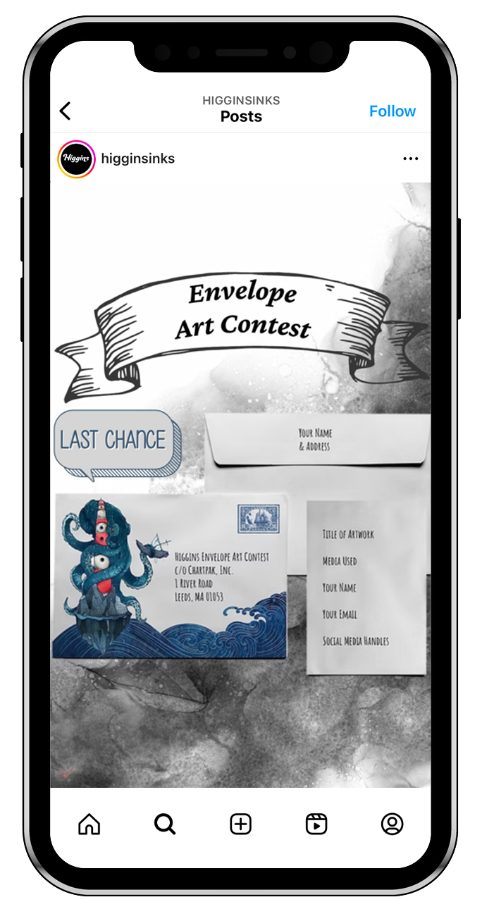
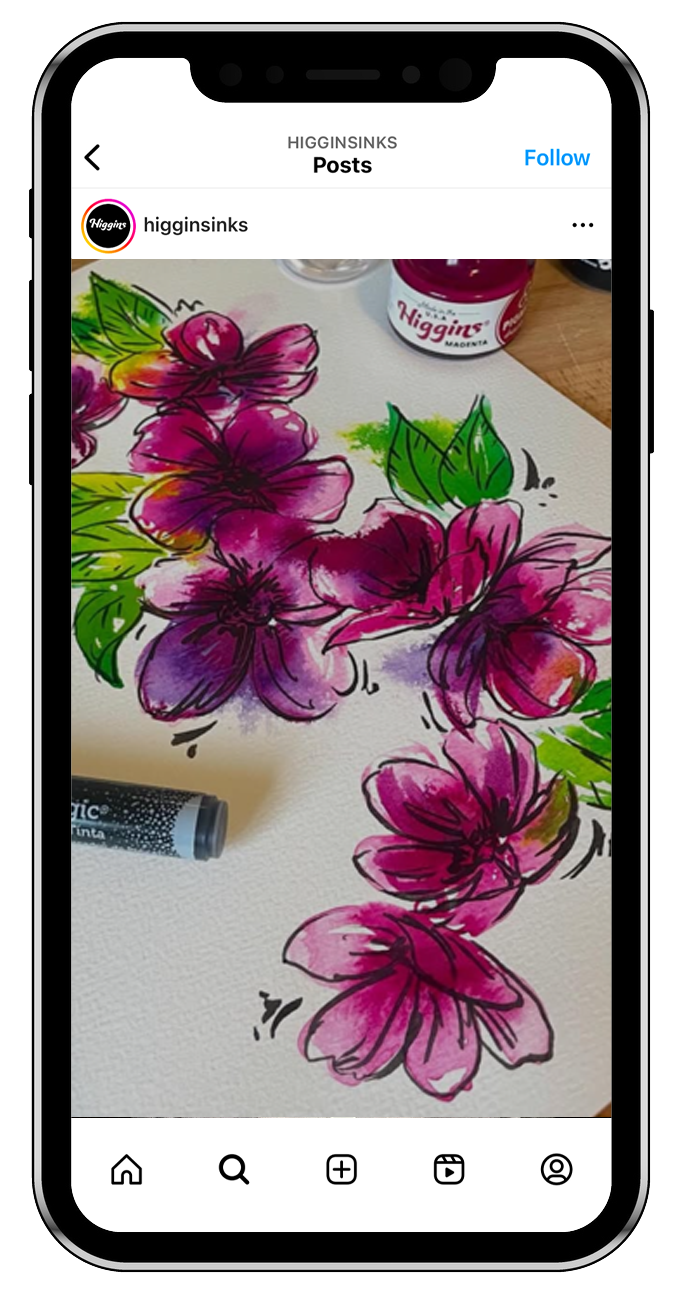
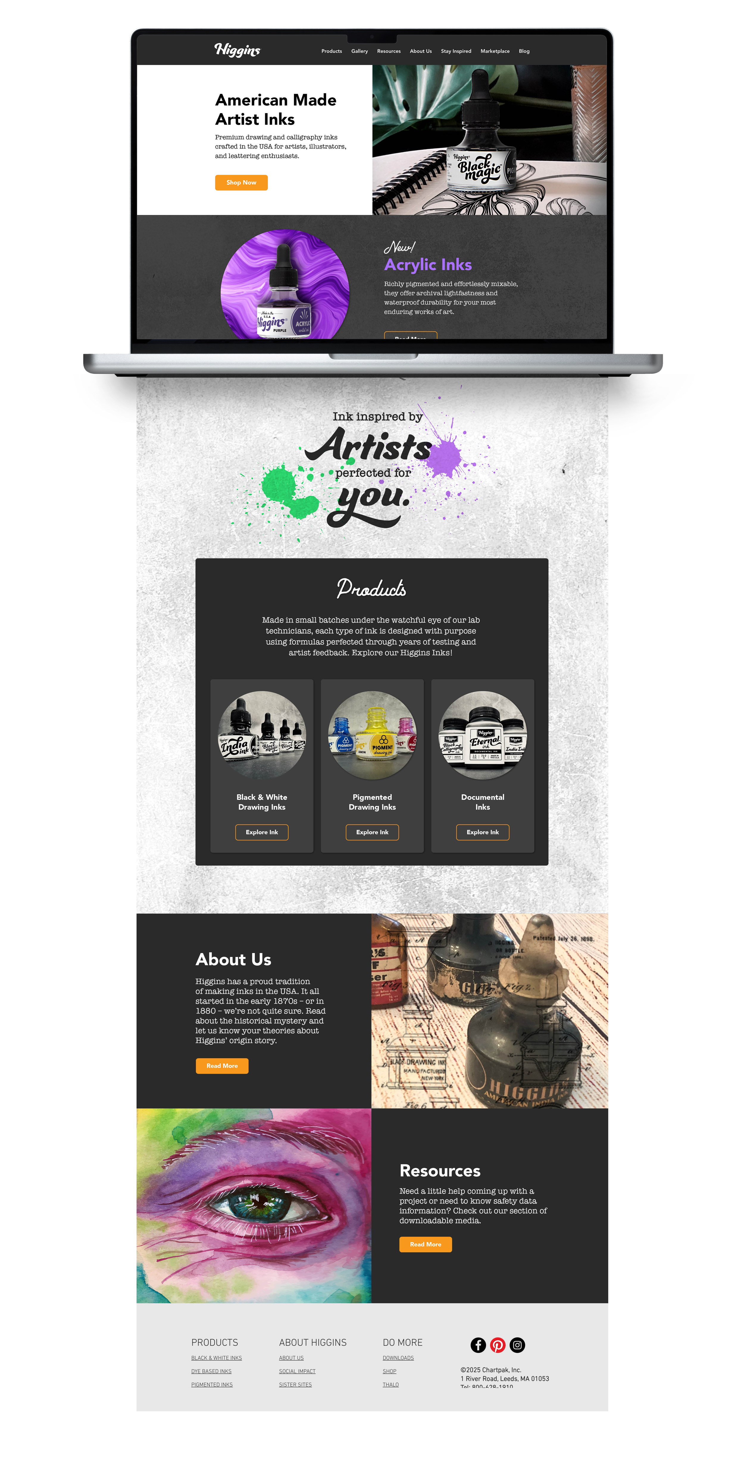
We created an identity that felt inky, artistic, and rooted in calligraphy (can you find the hidden ink drop?). We replaced the inconsistent screen-printed bottles with labels and upgraded the packaging from plastic to glass, harkening back to Higgins’ bottles of the past. A six-bottle self-shipper doubled as a point-of-purchase display, while the new visual language extended across packaging, web, and social.
My role:
Brand identity, packaging, art direction, and visual system development across print, retail, web, and social.
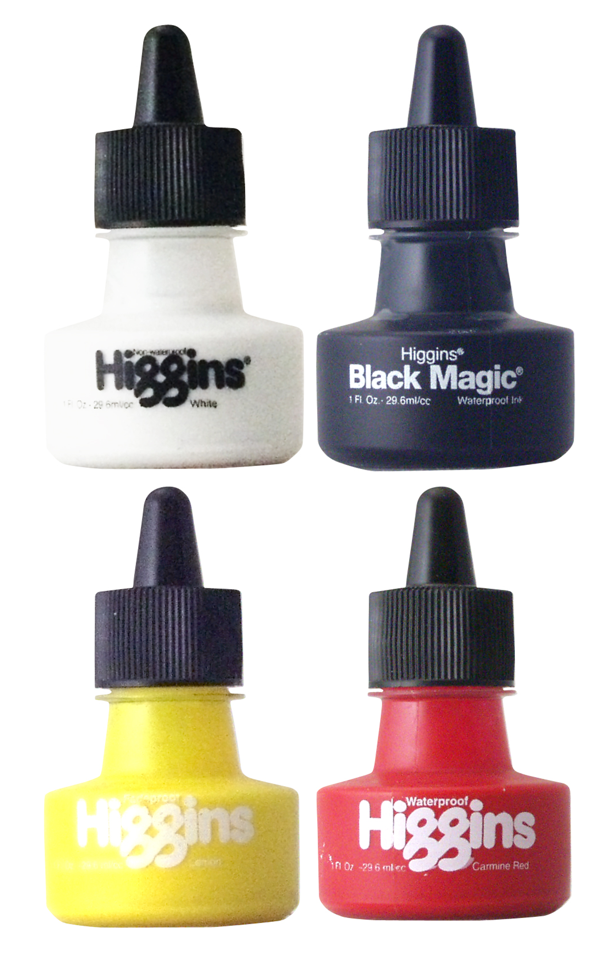
old bottles




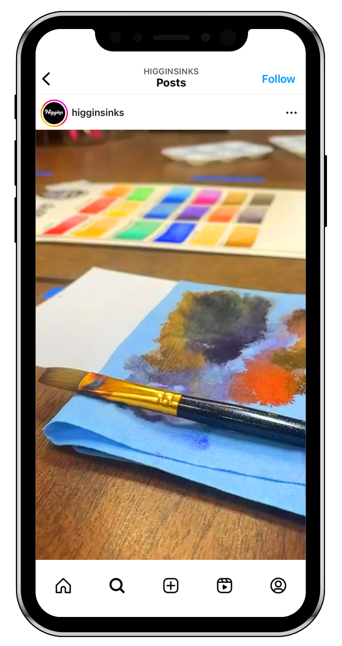
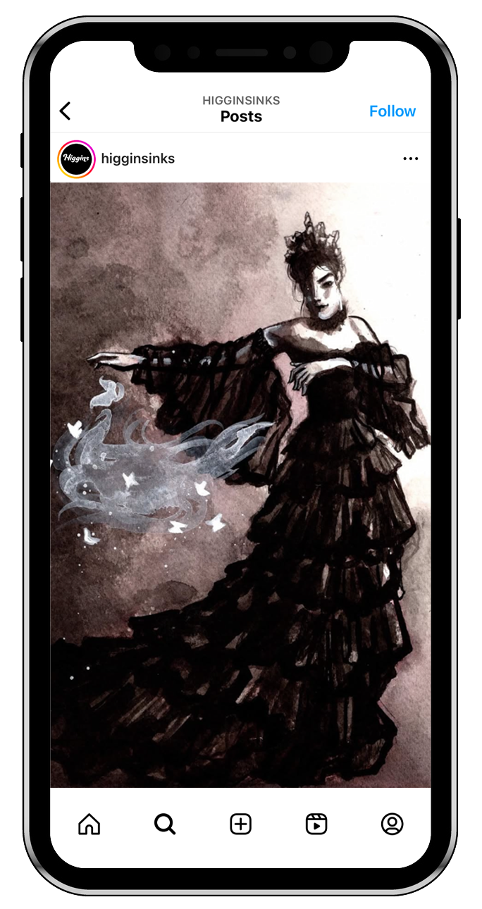
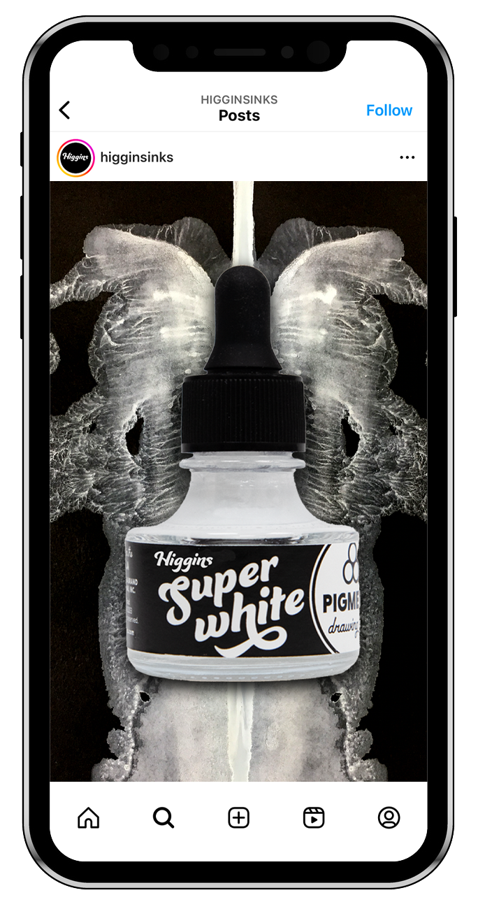
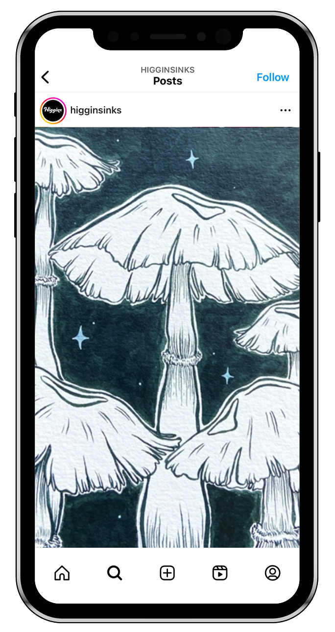
Creative Direction: Lana Casiello-Boyle
Social Manager: Jen Cadran